MAGGIE DOUGLAS. graphic designer.
MAGGIE DOUGLAS. graphic designer.

I was born and raised in Des Moines, Iowa, went to Loras College, and received a bachelor of arts in Studio Art and Digital Design. Since then, I have worked as a graphic designer for 9 years, developing my technical skills and finding a love for bringing a client’s brand mission and culture to life, visually.
When not designing, I can be found doing yoga, spending time outside, cooking and eating delicious food, and painting in my studio.
Brand Identity
Request:
Create an internal brand that is representative and celebratory of the diverse community that UnityPoint Health (UPH) serves and our team members.
Client
UnityPoint Health Diversity, Equity and Inclusion (DEI)

Solution:
Recognize the equity and diversity of these individuals visually by using basic shapes that are equally sized but distinctive in their color and shape to represent diverse individuals. Portrait photos can also be utilized in some shapes to humanize the brand.
Emphasize the strength of diverse communities by combining these unique shapes to form a quilt pattern. This highlights that these individuals hold an equal weight in the community, while portraying the beauty that can be created when they all work together.
Using these basic shapes as building blocks, new shapes can be formed to focus on certain communities but maintain the overall DEI look and feel.


Uses:
This bold branding is able to be sized for whatever need:
Brochures
Booklets
Social Media Posts
T-shirts
Environmental Branding
Internal and External Marketing


Brand Identity
Client
UPH Maternity
Request:
Create an internal brand that visually relates to both women’s health and early age pediatrics. Collateral will be given to expecting or new mothers, which is a stressful time, so offset this with calming and joyful designs.

Solution:
Using UPH brand purples and blues for a mature color palette alongside hand-drawn icons and patterns that add an approachable look and feel. Icons range from childlike (moon and stars) to mature (flowers), to bring a lightness to a possibly stressful time in a person’s life.


Uses:
By using different icons, colors, and patterns, this brand is flexible for use when covering different topics within these services.
Baby books
Digital brand campaigns
Information packets
Fundraising marketing

Brand Identity

Client
Cheap Wine Club
Request:
This is a brand I came up with for fun. I wanted to create something that brought together clean design with a grunge overtone. I thought this combination of styles perfectly fit the idea of a wine subscription that was affordable, but still high quality.


Solution:
Combining hand-drawn text and patterns with a grunge texture, but use an upscale color palette and bold color blocking to maintain a clean look.


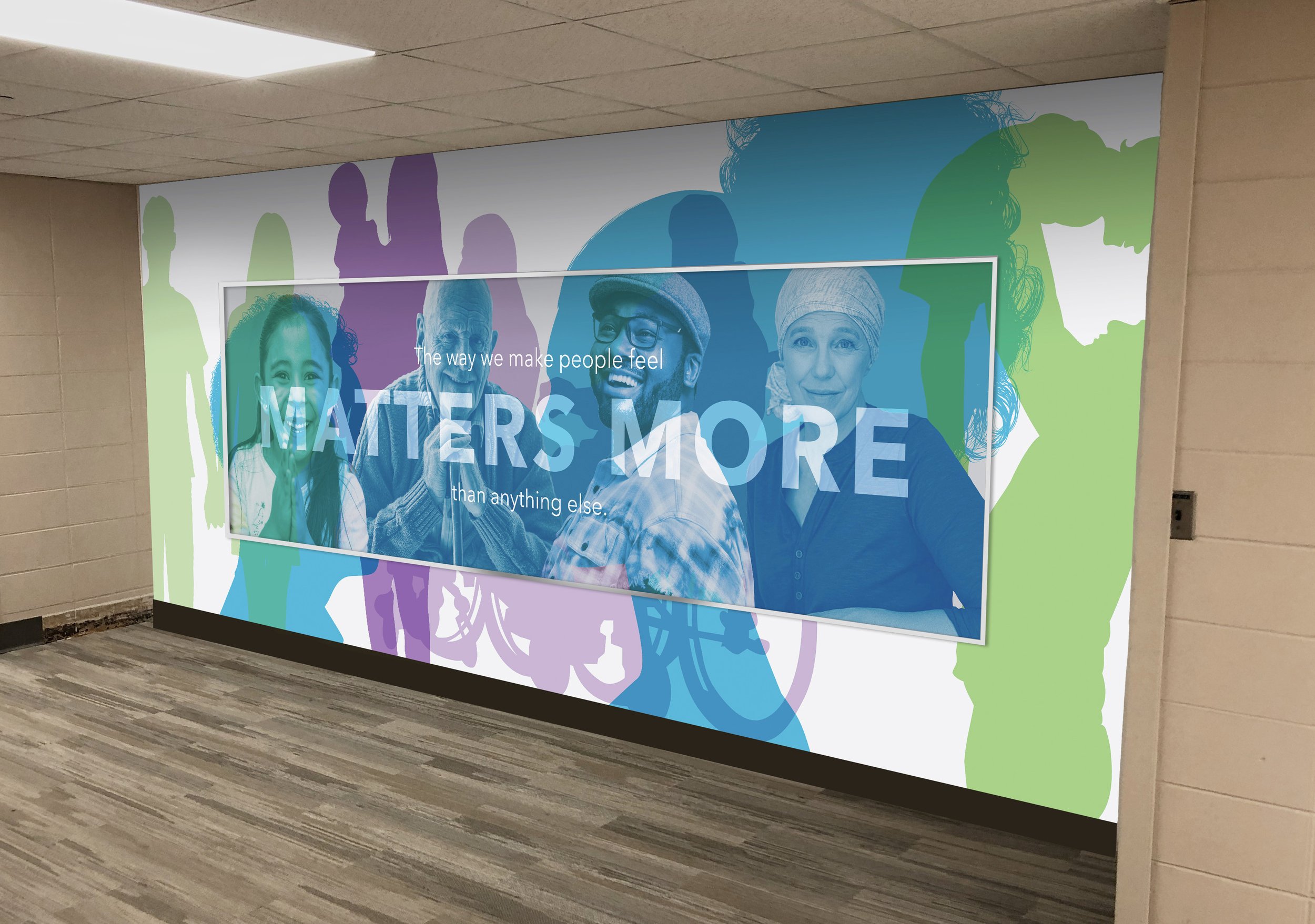
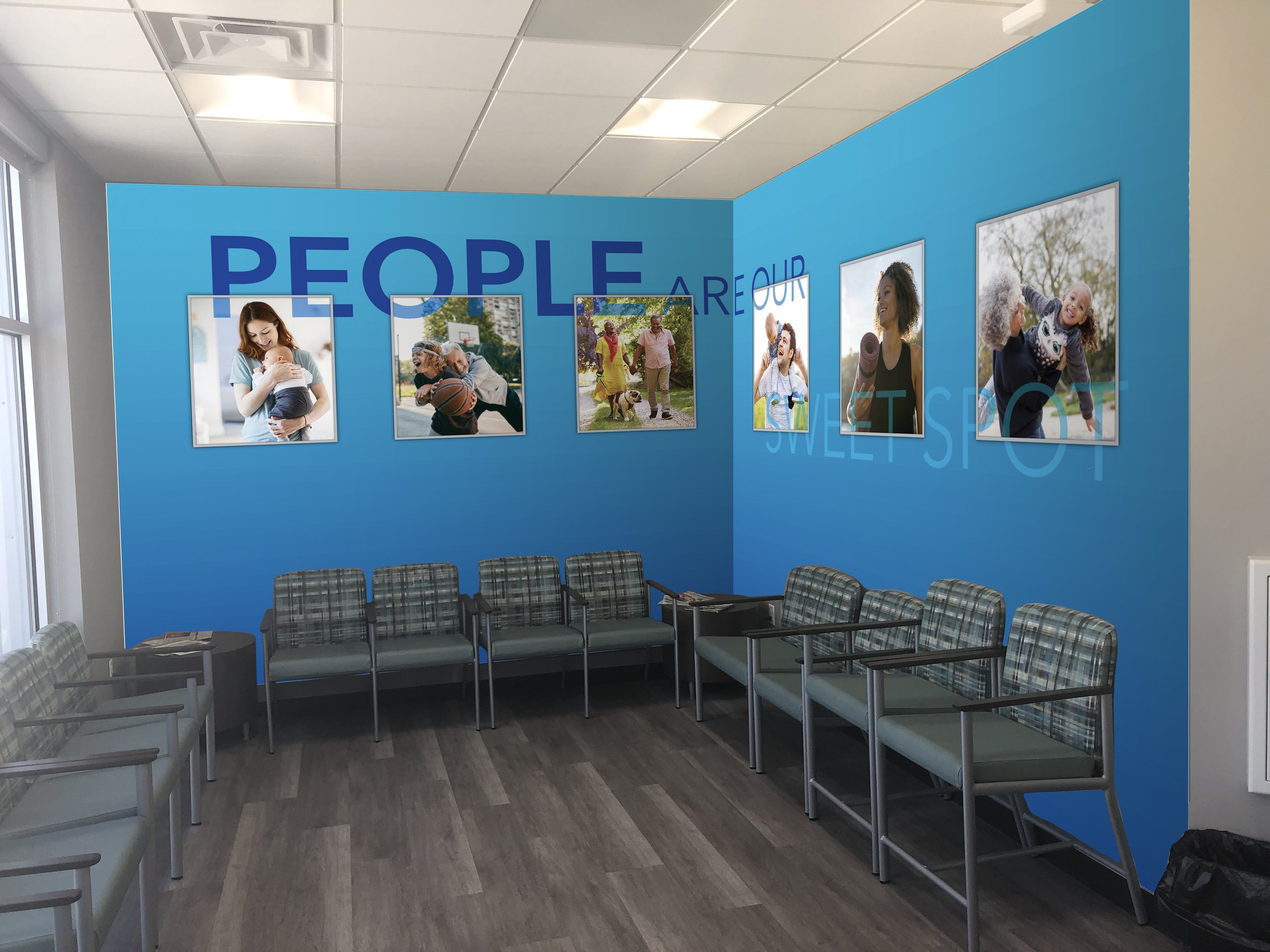
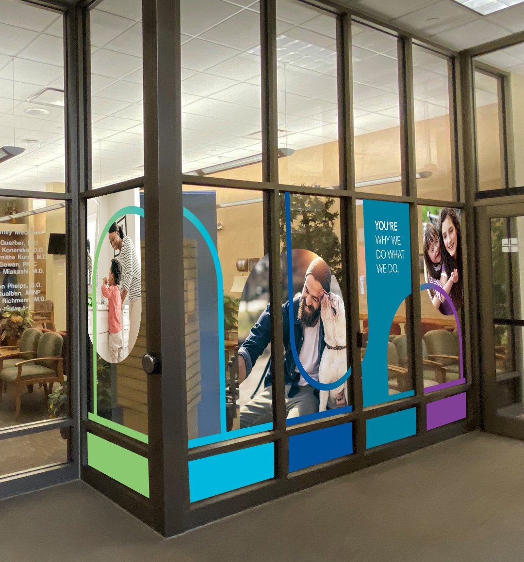
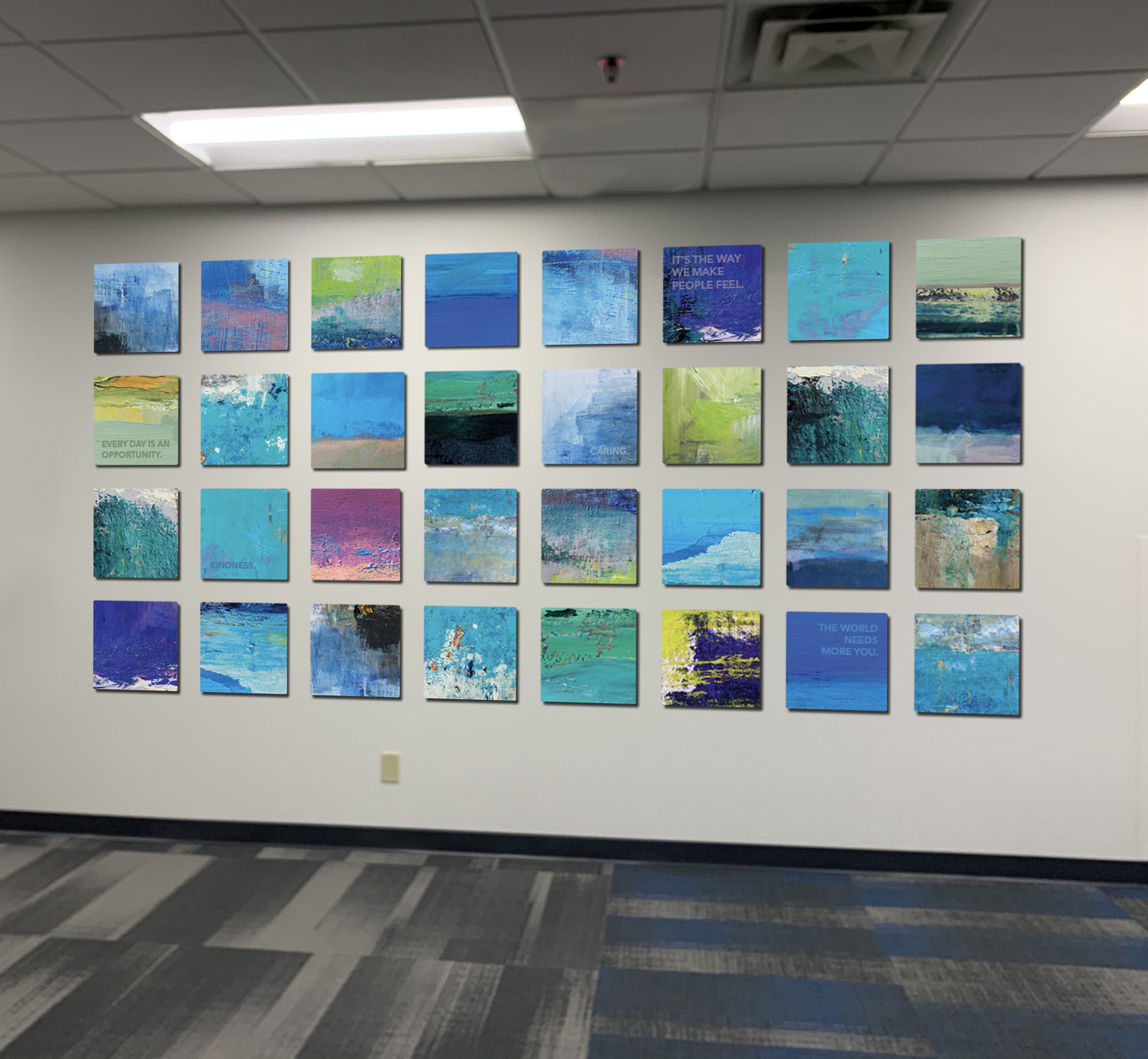
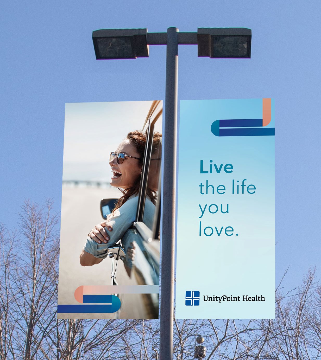
Environmental Design
I have had the opportunity to design and oversee production on many environmental design projects in UPH clinics and hospitals. These projects focus on creating an uplifting and welcoming environment for patients, because often, being in a doctor’s office or hospital can be stressful.


Freelance Work
-
![]()
Tim Wicca
Brand design for artist focused on patterns formed naturally through experimentation with non-traditional materials
-
![]()
Enfolding Community
Branding for digital and print materials for memorial project using paper cranes
-
![]()
Gemini Boutique
Logo design for female-owned boutique, focused on upscale, feminine styles
-
![]()
DMARCC
Brochure design based on established branding, asked to create an easy-to-read, eye-catching layout
-
![]()
Molly and Josip
Wedding save the date and invitation design


